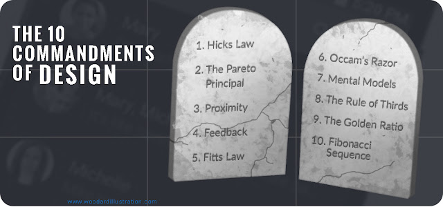
The 10 Commandments of Design
1. Hick’s Law
Every
additional choice increases the time to complete an action. This means that the
more options a user has when using your website or web application the more
difficult it will be to use. This law really speaks the importance of
simplicity.
2. The Pareto Principal, or the 80/20 Rule
10. Fibonacci Sequence
2. The Pareto Principal, or the 80/20 Rule
A high percentage of users will perform a low
percentage of actions. In terms of web applications, most of your users will
perform a small percentage of tasks. Using the 80/20 rule can help prioritize
features or remove unnecessary functionality that may only cater to 20% of
users.
3. Proximity
Giving
a user a clear indication that something has happened, is happening, or could
happen.
Simplicity
over complexity. Less is more. “A design isn’t finished when there is nothing
more to add, but when there is nothing left to take away.” (look at 80/20 rule)
7. Mental Models

7. Mental Models
It
is easier for users to understand and learn from something new if it has been
modeled off of something they already understand. (ex. iOS Human Interface Guidelines,
traffic lights)
8. The Rule Of Thirds
8. The Rule Of Thirds
Breaking
up a rectangle into thirds both vertically and horizontally to achieve balance.
Using a grid can assist with spacing elements and identifying focal points.
9. The Golden Ratio
9. The Golden Ratio
Breaking
up a rectangle into a square and smaller rectangle and the continuing that
process. This can help in achieving a balanced composition.
10. Fibonacci Sequence


